Airline passengers routinely commend Southwest Airlines for serving good food. That’s great, but the problem is that Southwest does not and never has served food [1]. In 2016 U.S. poll 13% of respondents said they would rather a giant meteor hit the earth than Clinton or Trump win the presidency, but that’s obviously not true [2]. When Ted Cruz was running for the 2016 Republican presidential nomination 38% of voters said in a poll that he is the Zodiac Killer [3]. These ridiculous results show us that we must be careful when interpreting the results of surveys, and this is true even for simple questions about food. For instance, just asking people what they ate recently is prone to errors, as people often have trouble recalling what they at and are known to exhibit biases [1].
Video 1—People love bands they’ve never heard
In particular, they like to provide answers that make themselves look good, even if it is on an anonymous survey. Consider Figure 1 below, where most people say that they put the well-being of farm animals in front of low meat prices, but that the average American does not. This is mathematically impossible. What is happening is that many people are exhibiting social desirability bias, where they give false statements because they believe said statements are desired by others. Note that this result was from an anonymous phone survey, so people want to impress strangers even over the phone!
Figure 1—Everyone thinks they are better than average

It is also the case that people often don’t pay close attention to surveys. Some people take surveys for monetary rewards, and may wish to just hurry through the questions and thus provide answers without really reading the question carefully. Sometimes trap questions can be used to identify these people, like the one below. Anyone who reads the question carefully will answer “none of the above” whereas someone who does not read it carefully will tend to select something else. In a survey of 1,000 Oklahomans, only 757 selected “none of the above”, so about one-quarter of the survey respondents aren’t really reading the questions well.
Figure 2—Catching careless survey respondents using trap questions

Imperfect as they are, surveys can still provide useful information, and that is why they are a routine activity for many organizations.
Making samples behave differently
(A) Weighted Averages
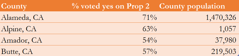
A simple average (what you simply call “the average”) assigns an equal weight to all observations, where one value is no more important than another. For instance, suppose we are interested in the percent of Californians who voted in favor of Prop 2 in the 2008 election, which would ban the use of cramped cages in livestock production. You have detailed data on how people in four of the counties voted, shown below. A simple average of the percentages is average = (71+63+54+57)/4 = 61%. In this calculation the 71% for Alameda contributes equally to the average compared to the other counties. However, notice that the population in each county is not the same. It would seem reasonable to give the percentage for Alameda more weight than the other countires, since Alameda has so many more people.
Figure 3—Votes cast in 2008 election on Prop 2
The simple average should be replaced by a weighted-average average, where each percentage is assigned a weight corresponding to its population relative to other county populations. That is, the weight equals the population. You simply multiply each percentage by the weight, sum those products, and then divide by the sum of all the weights. Notice in the formula for the weighted average below, if we assigned an equal weight to each percentages, (it could be a weight of 1 or 1,000,000, so long as it is the same for all percentages), the weighted average becomes the simple average.
Figure 4—Weighted averages


Notice the weighted average of 68.84% is higher than the simple average of 61%. This makes sense, as Alameda county has both the highest percentage and the highest population, so assigning it a greater weight should bring the average percentage up.
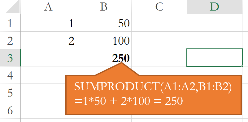
The subject of weighted averages is a great place to learn the sumproduct formula in Excel. This formula accepts two arrays of equal dimensions (equal number of rows or columns), multiplies each element of one array by the corrsponding element of the other array, and them sums all the products. That’s probably confusing, so just look at Figure 5 below. There is the array in A1:A2, which has two rows and one column, and there is the array in B1:B2, which an equal number of rows and columns. When you pass the address of each array into the sumproduct formula, it “sums” the “products” as 1*50 + 2*100 = 250.
Figure 5—The sumproduct formula
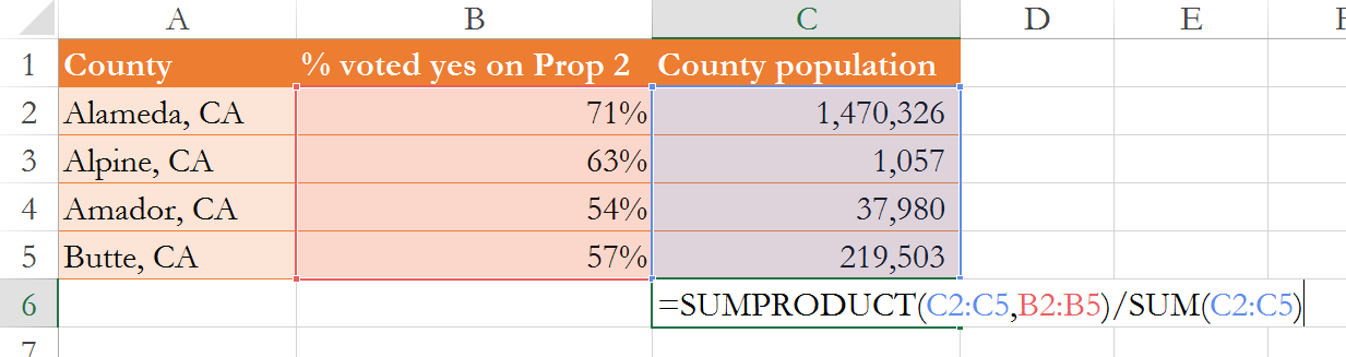
This formula makes the calculation of weighted averages easy, as one array can be the weights and the other array can be the variable of interest. See below, where I first use the sumproduct formula to sum the products of each percentage (the variable of interest) multipled by the county population (the weights), then I divide that by the sum of all the weights, yielding a weighted average of 68.84%.
Figure 6—Calculating weighted averages using the sumproduct formula
(B) Making non-representative samples look representative
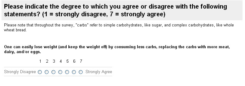
In my 2013 class we constructed a survey where we asked individuals the question in Figure 7. The respondents were roughly half students and half their parents, and this sample is certainly not representative of how America as a whole would answer. It over-samples the young, relative to the U.S. population, and under-samples adults.
You can download the data here.
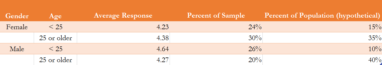
Figure 7—Survey Question
The figure below shows the average response from young females, adult females, young males, and adult males. It also shows that roughly half of the sample is comprised of young people less than 25 years of age, when in the population of all Americans that percentage would be far less. If you take the simple average of all the percentages the average response is 4.39. But because the sample is not representative, we do not believe the average for the entire U.S. population to be 4.39.
So our survey is not representative of the U.S. population. That doesn't mean we can't use the survey to make inferences about the U.S. population, though. That is, we can make a non-representative survey behave like a representative survey. All we have to do is calculate a weighted average of the survey responses from each of the four age / gender categories, and weight each average by their percentage of the U.S. population. The figure below presents a hypothetical scenario where young females constitute 15% of all Americans. The following weighted average is then an unbiased estimate of what the average survey response would be, if the sample were actually representative. Whereas the simple average of the entire sample is 4.39, a weighted average, where each group is weighted by their percent representation of the population, is 4.34. So the sample on average was 4.39, but we expect the average for all Americans to be 4.34. (Notice that because all the weights sum to one, we do notneed to divide by the sum of the weights in this case.)
U.S. Average Response = (0.24)(4.23) + (0.30)(4.38) + (0.26)(4.64) + (0.20)(4.27) = 4.34
What this means is that if we did not use weighted averages to make the data representative of the American public we might overestimate the popularity of low-carb diets.
Figure 8—Data from survey
Most public opinion polls, especially those about politicians, use such weighted average methods to make their sample of survey respondents better reflect the nation as a whole, and when people do not like the results of such polling, they sometimes question the weighting methods used—as illustrated in the video clip below.
Video 2—The Colbert Report on Surveys and Sampling
Communicating survey results using histograms
Video 3—Tutorial on histograms
Estimating correlations
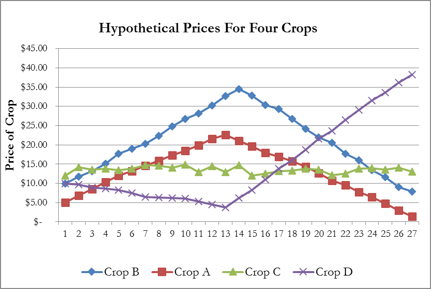
A correlation coefficient, referred to technically as a Pearson' Product Moment Correlation, is a statistic between -1 and 1. It indicates the degree to which movements of two data series move in tandem, move in opposite directions, or appear to have no relation to one another. We will not study exactly how it is calculated, but we will need to understand how to use it. To better explain correlation coefficients, consider the prices of three hypothetical crops shown in Figure 9 below.
- Positive Correlation—Notice how the prices of crops A and B move in tandem. When one rises, the other rises. When on falls, the other tends to fall. This is a case of positive correlation. The correlation between these two crop prices will be between 0 and 1, and the more their increases and decreases occur at the same time the close the correlation will be to 1.
- No Correlation—Crop C rises in some years and falls in other years, but these rises and falls illustrate no pattern compared to the other crops. Thus, we say there is no correlation between crop C and crops A, B, or D. The phrase "uncorrelated" is also used. Theoretically, if there is no correlation the correlation coefficient should equal zero, but in reality it never exactly equals zero. We must either render a personal judgment about whether the correlation coefficient is close enough to zero to call the two data series uncorrelated, or we must use the hypothesis test described below in section G.
- Negative Correlation—The price of Crop D behaves oppositely of crops A and B. When crop A's price is rising the price of crop D falls. Likewise, when the price of A and B is falling that of crop D is rising. This is a case of negative correlation, when an increase in one data series tends to take place when another data series decreases. When two data are negatively correlated, their correlation coefficients will be between 0 and -1.
Figure 9—Illustrating The Concept Of Correlation
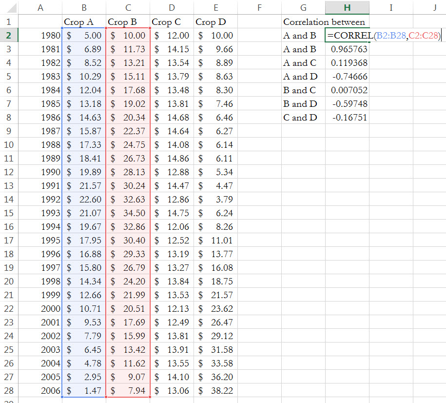
Calculating correlation coefficients is easy in Excel. Just use the CORREL function, as shown below, where I calculate the actual correlations of the crop prices from Figure 1. You can follow along by downloading the dataYou can download these data at here.
Indeed, as the graph suggests the correlation between A and B is close to one—0.97, to be exact. Crop C has a small correlation (in absolute value) with any other crop, suggesting the real correlation is small to zero. Finally, crop D has a negative correlation with crops A and B, which is close to one in absolute value.
Figure 10—Calculating the correlation coefficients using the CORREL Excel function
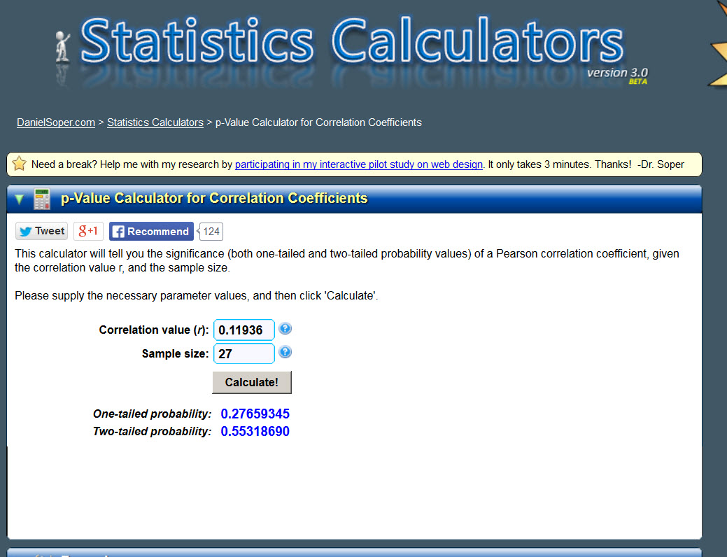
Now let’s conduct a statistical test to discern which correlations are statistically significant and should be taken seriously, and which are not, and should be considered to have a correlation of zero. Fortunate for us, a convenient webpage is available here that makes this test easy. All it requires is that we enter the correlation and the sample size. I want to test whether the correlation in prices between Crops A and C is statistically significant, so I enter the correlation of 0.11936. The data are from 1980 to 2006, so I then enter the sample size of 27, and click calculate.
Null hypothesis: correlation = 0
Alternative hypothesis: correlation ≠ 0
The p-value is the probability we are wrong if we reject the null hypothesis
It spits out two p-values, a one-tail probability and a two-tail probability. We are just testing whether the correlation is different from zero, not whether it is negative or positive, so we look at the two-tail probability only. This probability is 0.55, and is a p-value. Remember, this p-value is the probability we are wrong if we reject the null hypothesis, so we usually only reject the null if the p-value is 0.05 or less. This is clearly not the case here, so we fail to reject the null, say the correlation is statistically insignificant, and basically treat the correlation as if its exact value is zero.
If we conduct the same test for the correlation of Crops B and C the p-value is 0.97, and the p-value for Crops C and D is 0.40. Thus, we conclude that the price for Crop C is uncorrelated with any of the other crops.
What happens if we test the statistical significance of the correlation between Crops A and B? We then get a p-value of zero, meaning we can deem the correlation to be statistically significance with a 0% of being wrong.
Figure 11—Website at http://www.danielsoper.com/statcalc3/calc.aspx?id=44 for determining statistically significant correlations
Tips for writing survey questions
This source has a terrific list of tips.
References
[1] Bopp, Suzanne B. February 23, 2015. “Consumer Trends: What are we eating?” Drovers CattleNework.com. Accessed June 4, 2015 at http://www.cattlenetwork.com/community/contributors/consumer-trends-what-are-we-eating.
[2] Public Policy Polling. June 30, 2016. Presidential Race Shaping Up Similarly to 2012 [press release]. Accessed July 6, 2016 at http://www.publicpolicypolling.com/pdf/2015/PPP_Release_National_63016.pdf.
[3] Public Policy Polling. February 25, 2016. “Trump Leads Rubio Even Head To Head in Florida. Accessed September 19, 2016 at http://www.publicpolicypolling.com/main/2016/02/trump-leads-rubio-even-head-to-head-in-florida.html.